What Makes a Great Artist Portfolio Website?
Let Your Work Take Center Stage
The best artist portfolio websites share one quality: the design gets out of the way. Clean layouts, neutral backgrounds, and enough whitespace let each piece breathe. Visitors come to see your art - not your CSS. A simple visual framework that highlights your work, rather than competing with it, is almost always the right call.
Keep Navigation Simple
A visitor should find your gallery in under three seconds. The most effective creative portfolios have no more than four or five menu items: Work, About, Contact, and maybe Shop or Press. Anything beyond that starts to dilute focus. Think of your navigation as a signpost, not a sitemap.
Make It Mobile-Responsive
More than half of web browsing happens on phones, and potential clients and curators are no exception. A portfolio that looks stunning on desktop but falls apart on mobile is a missed opportunity. Make sure your images scale correctly, your text stays readable, and your contact details are easy to tap.
If you're building with Wegic, mobile responsiveness is handled automatically - every site it generates adapts to any screen size without extra configuration on your end.
Tell Your Story with an Artist Statement
Your work speaks first - but a short artist statement tells visitors who's behind it. A few sentences about what you make, why you make it, and what drives your action can be the difference between a visitor clicking away and reaching out. One tight paragraph often works better than a full essay.
10 Best Artist Portfolio Website Example
Redd Walitzki — Surrealist Painter
Website: reddwalitzki.com
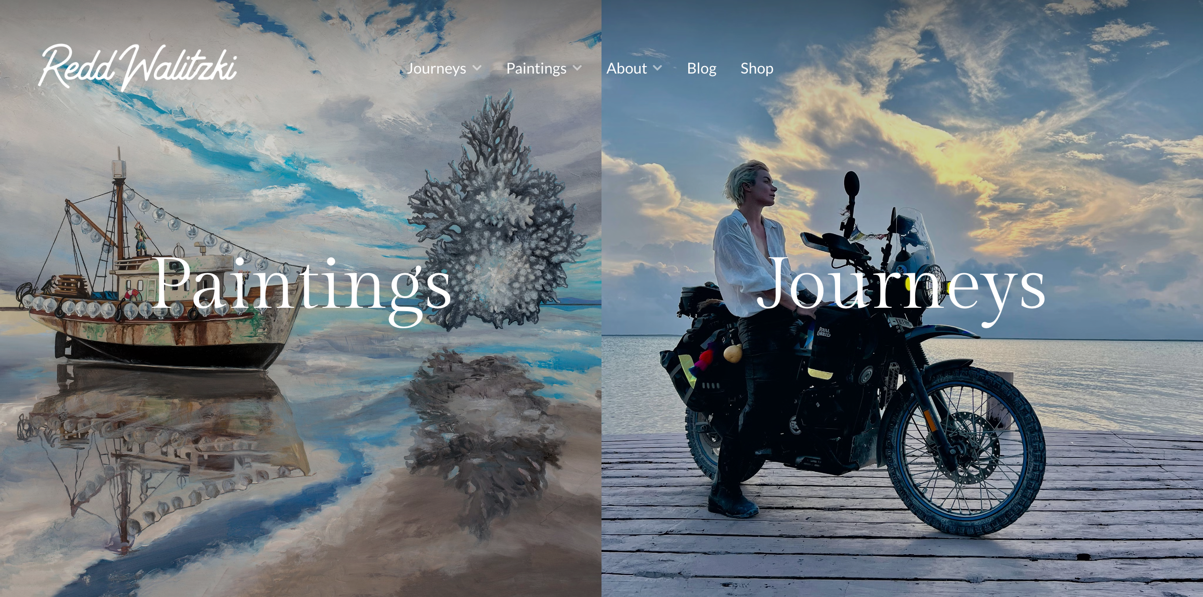
Redd Walitzki is a surrealist painter — and a motorcyclist who has been riding through the Americas since 2021. Her portfolio doesn't hide the second part. Paintings and travel documentation sit side by side, and the result is a portrait of a person, not just a showcase of work. You leave knowing who she is, not just what she makes.
What works: showing your A and B sides. Clients and collectors don't just hire skills - they hire people. A portfolio that reveals personality and life alongside the work creates a connection that a gallery alone never can.
Evelyn Tan — Digital Illustrator
Website: evelyntan.net
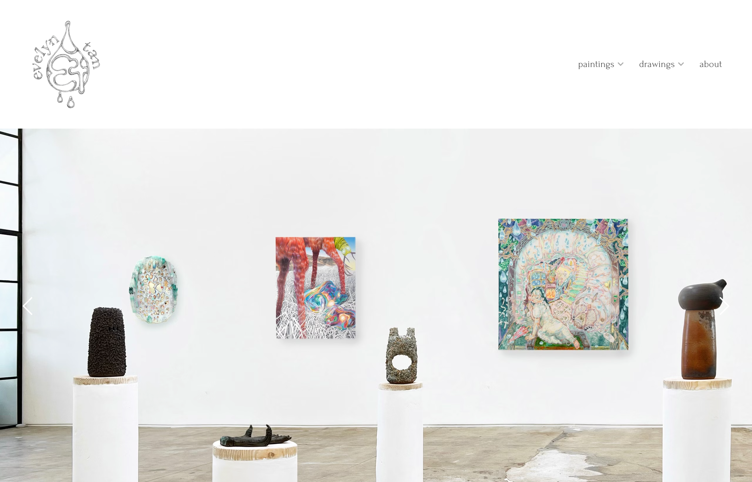
Evelyn Tan's homepage is her gallery. Scroll and you're already inside the work. Her About page includes a full CV, giving visitors the professional context to match the art. Most usefully, she organizes her work by purpose rather than style: editorial, books, personal work. A client knows exactly where to look.
What works: categorizing by use rather than aesthetic puts the viewer's needs first. An art director looking for editorial work doesn't want to browse - they want a direct answer.
Shivani Aggarwal — Painter & Sculptor

Website: shivaniaggarwal.art
Shivani Aggarwal works across painting, sculpture, and installation. A sidebar index keeps the structure clear — visitors always know where they are and what else is available. Each work is displayed centrally, alone, and large: the full focus of the screen. A recurring visual motif and a prominent artist statement tie the varied disciplines together, giving the portfolio a clear identity despite spanning multiple media.
What works: a sidebar index solves navigation for deep portfolios without cluttering the main view. Pair that with single-work full-screen presentation, and every piece gets the weight it deserves.
Gosia Mosz — Children's Book Illustrator
Website: mosz.com
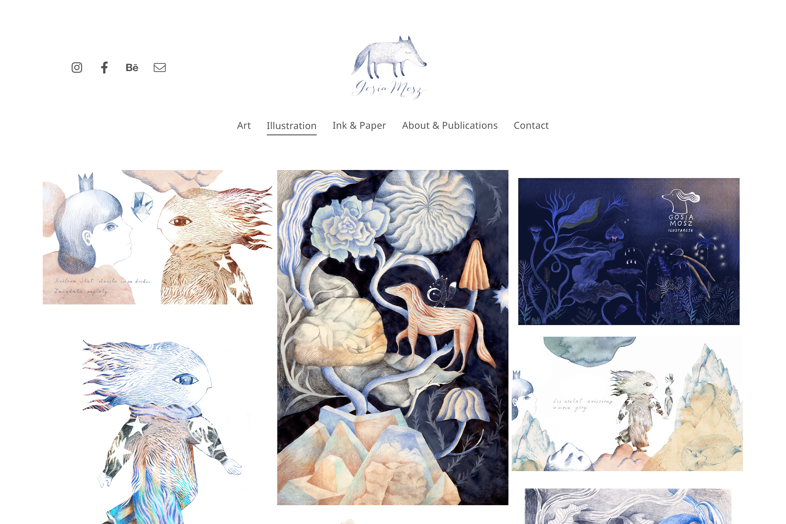
Gosia Mosz's homepage is just illustrations — arranged cleanly, nothing competing for attention. The layout is comfortable to browse in a way that makes you want to keep scrolling. There's no friction, no decisions to make. You just look, and keep looking.
What works: making the browsing experience itself pleasurable is a design goal worth designing for. A portfolio that feels good to scroll through earns more time from every visitor.
Kristina Rolander — Large-Scale Installation
Website: kristinarolander.com
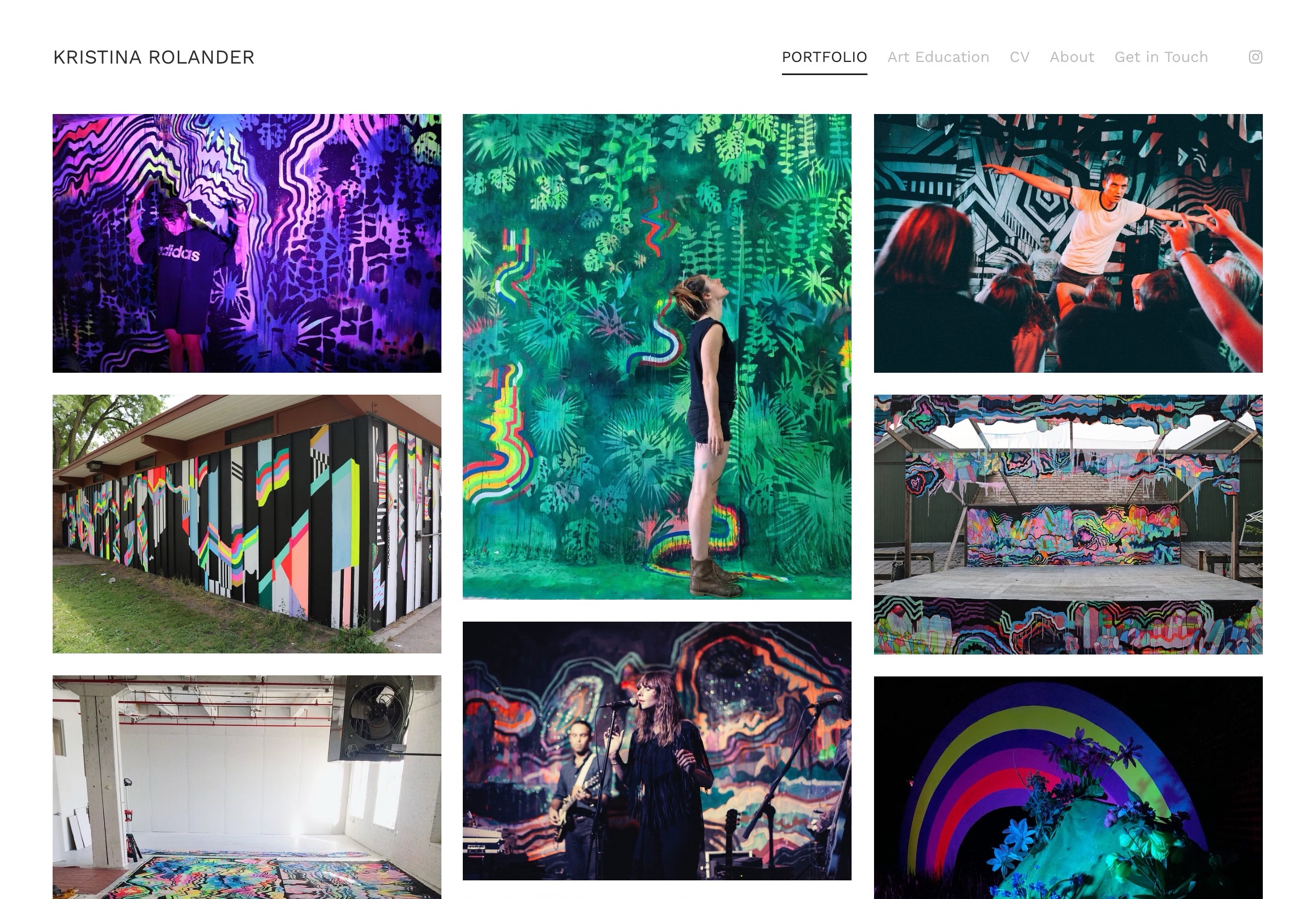
Kristina Rolander creates massive immersive installations and murals - festival stages, building-sized walls, UV-lit environments. Her homepage is a masonry grid of vivid photography, and she appears in several shots herself, giving visitors an immediate sense of the actual scale. The navigation includes Portfolio, Art Education, CV, About, and Get In Touch - a complete professional presence in five links.
What works: for large-scale work, including yourself in the photos is the most honest way to convey size. No caption needed — a person standing next to a wall-sized mural tells you everything.
Roxane Fiore — Mixed Media Artist
Website: roxanefiore.com
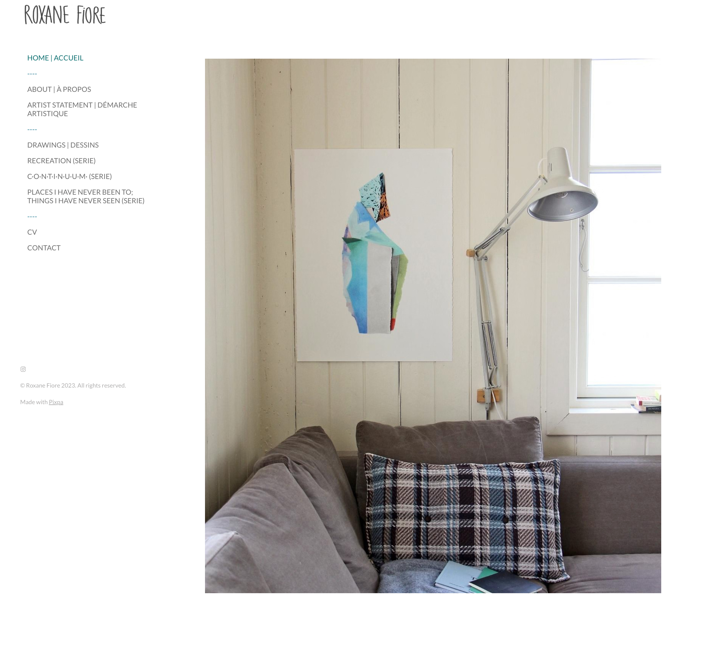
Roxane Fiore's portfolio opens with a single artwork — not on a white gallery wall, but hanging in a real home above a sofa, lamp nearby. The left sidebar lists her series by their full poetic titles: "Places I Have Never Been To; Things I Have Never Seen." Artist Statement gets its own navigation entry, separate from About. The site is bilingual in French and English throughout.
What works: showing work in a lived-in domestic setting does something a gallery photo can't — it helps a collector imagine the piece in their own home. That's a quiet but effective sales move.
Elif Sezen — Interdisciplinary Visual Artist
Website: elifsezen.com
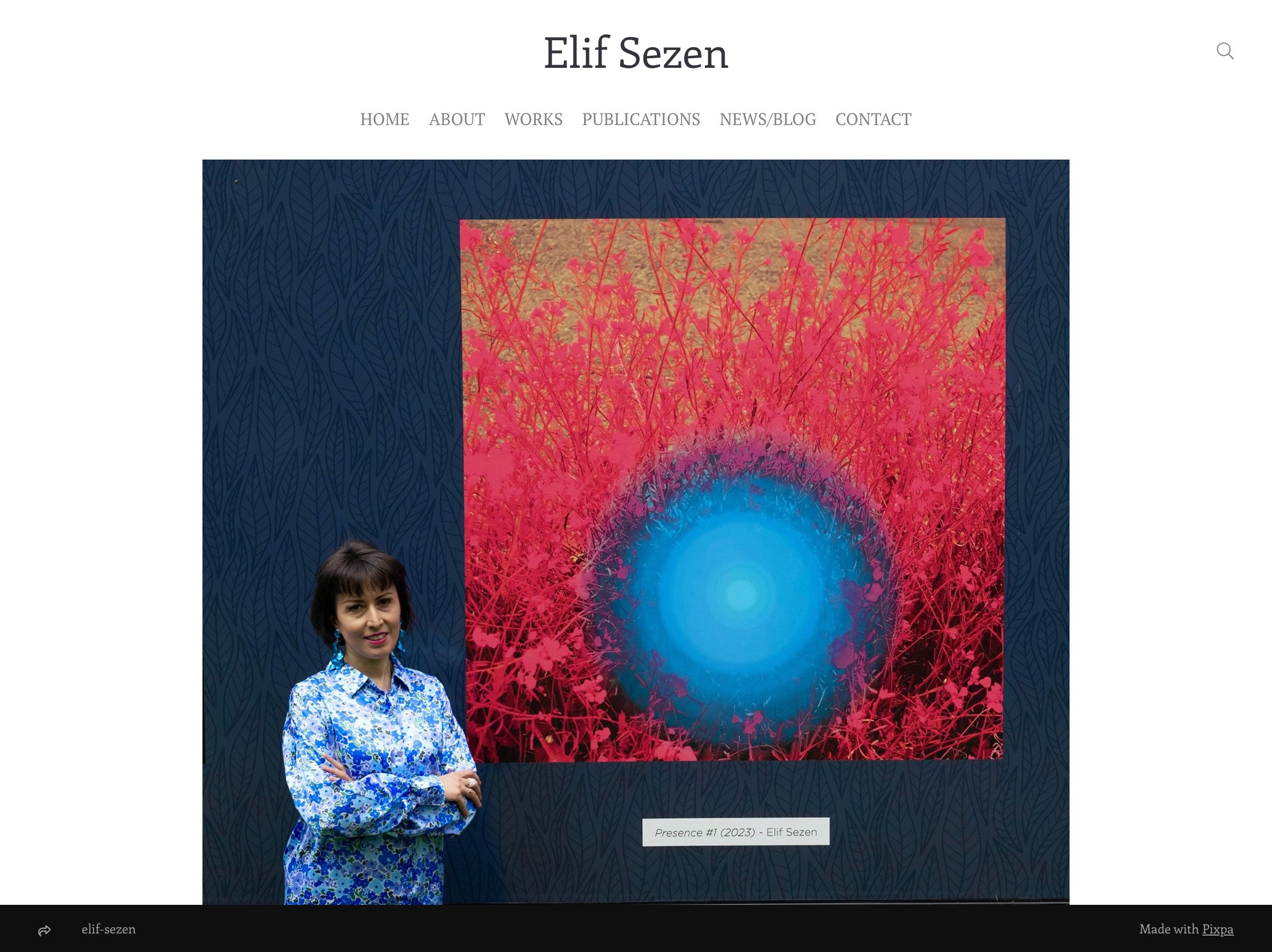
Elif Sezen's homepage opens with a portrait — before any work is shown, you meet the person. She is a visual artist, multilingual writer, and poet, and the site reflects all of it. Her works are organized as exhibition rooms: each one has a detailed introduction before you enter, and clicking in reveals a complete series presented as a coherent whole. The online curation is meticulous — this feels less like a portfolio and more like a gallery you're walking through.
What works: treating a website as a curated exhibition rather than a catalog changes how visitors experience the work. Context before entry, series as complete units — it's the difference between filing work away and presenting it.
Wegic Demo — Minimalist Painter Portfolio
Website: https://clara-webb-art.wegic.net
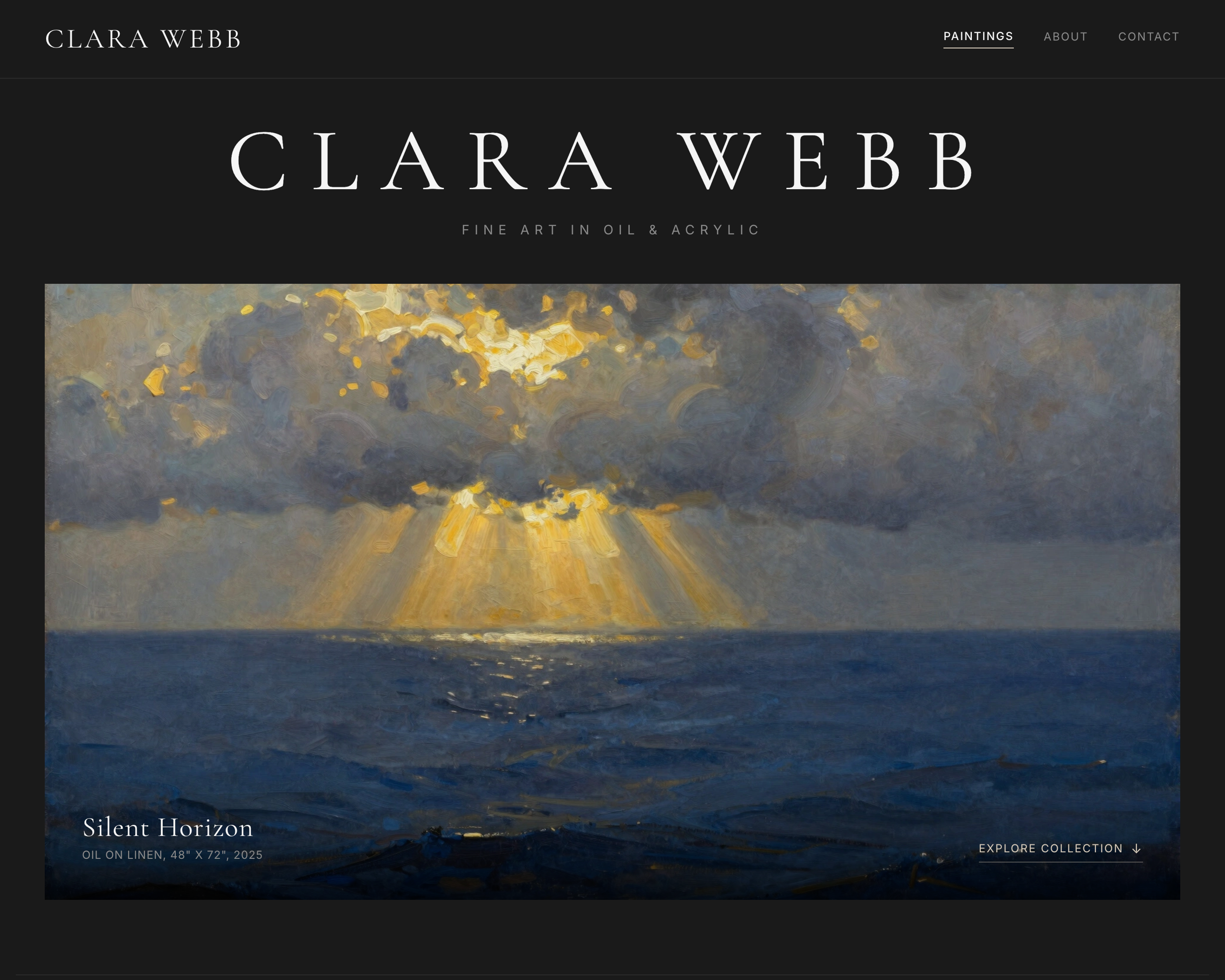
This portfolio was built with Wegic in under 10 minutes by describing the aesthetic in plain language: dark background, full-bleed painting images, minimal navigation. No coding, no template hunting.
What works: Wegic handles layout and responsiveness automatically — leaving more time for the actual work.
Wegic Demo — Illustration Portfolio
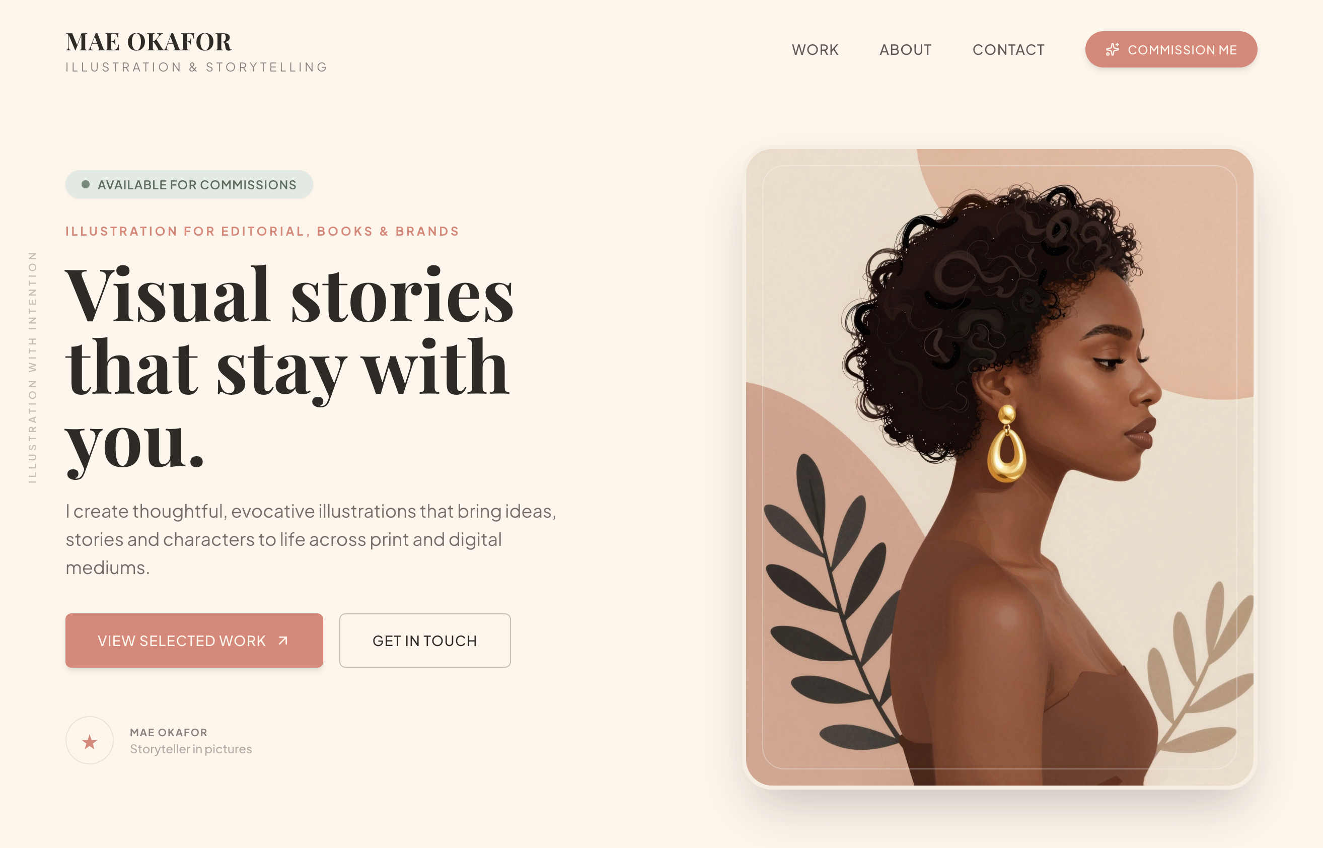
Website: https://mae-art-portfolio.wegic.net
A soft-palette illustration portfolio generated through Wegic's AI builder. The staggered grid and style-sorted navigation were specified in the prompt and rendered without manual configuration.
What works: describing what you want in words is faster than configuring it in a drag-and-drop editor.
Wegic Demo — Photography Portfolio
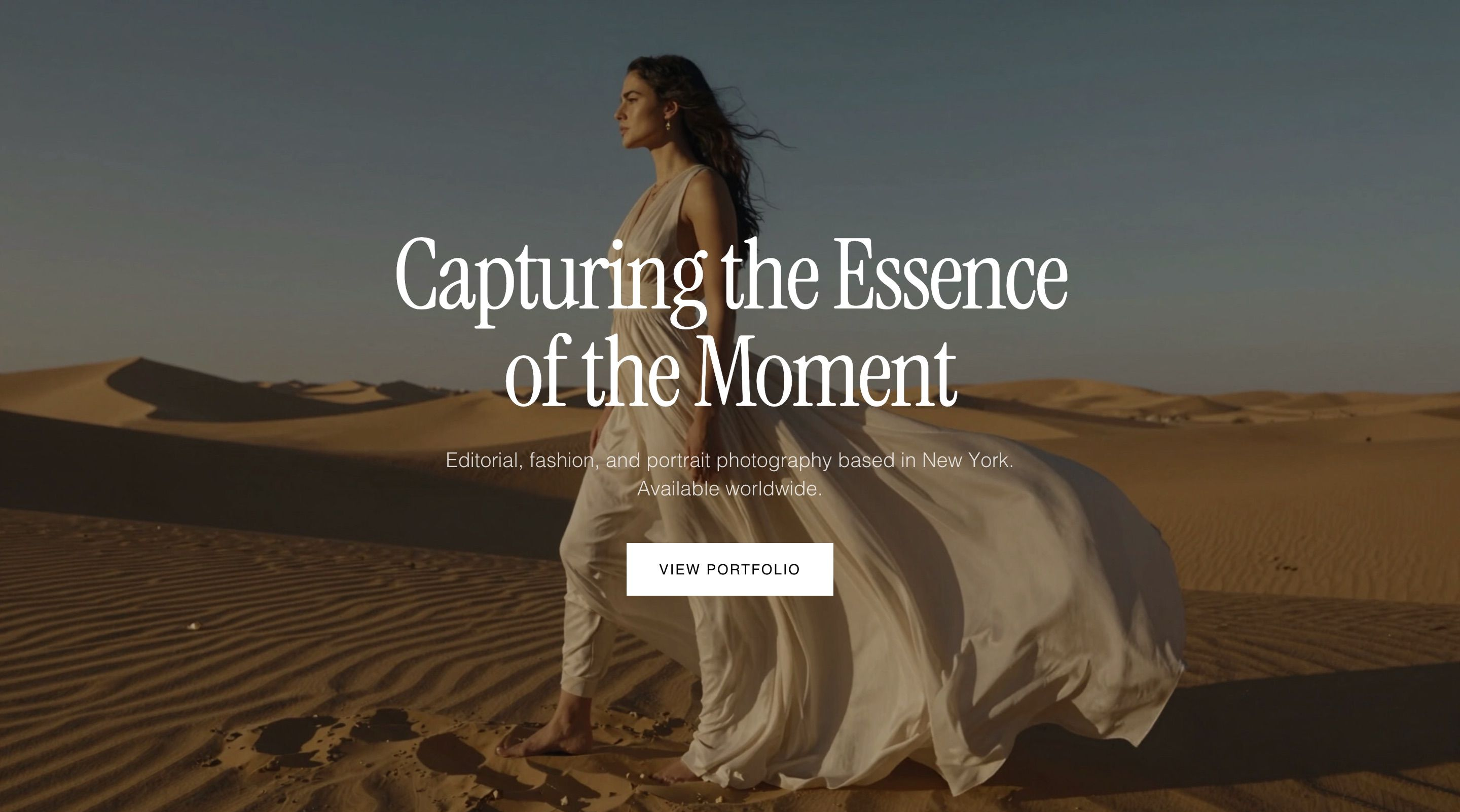
A full-bleed photography portfolio with a contact form and About page, built with Wegic. Total setup time: under 15 minutes.
What works: for photographers who need a clean, fast-loading portfolio without fuss, Wegic's output is hard to argue with at $2.99 to publish.
How to Build Your Own Artist Portfolio Website
Choose a Platform That Fits Your Budget and Needs
Most artists want the same thing from a portfolio website: something that looks good, doesn't take forever to set up, and won't cost a fortune to maintain. That's exactly what Wegic is built for.
Instead of dragging and dropping your way through a template, you describe your style in plain language — and Wegic generates a full multi-page portfolio website from that description. The layout, the structure, the visual feel: all handled. You stay in control of every piece of content and every image. Wegic handles the technical architecture so you don't have to.
Getting your site designed and live starts at $2.99 — no coding, no setup headache.
Your artwork stays yours. Wegic never uses your uploaded images to train AI models or for any other purpose. What you upload is yours alone.
Start with a Template That Matches Your Style
Before writing a word of copy, find a template that already feels like your work. The visual language — grid-based or organic, dark or light, image-heavy or text-balanced — shapes how your art is perceived before anyone reads anything. Browse Wegic's template library by aesthetic, or use the examples in this list as a reference for what structural choices resonate with your practice.
What to Include on Each Page
At minimum, a working artist portfolio needs three things: a Gallery (your best 10–20 pieces), an About page (bio, artist statement, contact details), and a way to get in touch. If you sell work, add a Shop. If you exhibit regularly, add a Press or Exhibitions page. Start lean and expand as needed — a focused portfolio you keep updated beats a sprawling one that goes stale.
FAQs
Q: What should be included in an artist portfolio?
Lead with your strongest work — a curated selection of 10–20 pieces that best represent your current practice and the type of commissions or opportunities you're after. Include an artist statement (a short paragraph on what you make and why), a biography, and clear contact information. If you exhibit or have been published, a Press or Exhibitions page adds credibility. Don't try to include everything you've ever made. A focused portfolio is more persuasive than a comprehensive archive.
Q: How many pieces should be in a professional art portfolio?
Between 10 and 20 pieces is the standard range. The number matters less than the quality of the selection — every piece should earn its place by showing range, demonstrating skill, or targeting a specific type of commission. If you're torn about including something, leave it out. Curating is part of the craft.
Q: What should you avoid in an online art portfolio?
The most common mistakes: including too many pieces, mixing unrelated styles without context, and using design that competes with the artwork rather than supporting it. On the technical side, avoid low-resolution images, slow load times, and contact information that requires effort to find. If a potential client has to hunt for your email address, some of them won't bother.
Q: What is the most affordable website builder for artists?
Carrd offers a free tier and paid plans from around $9/year — popular for its simplicity, though limited to single-page sites. For a full multi-page portfolio with more design control, Wegic gets your site designed and live starting at $2.99, significantly cheaper than Squarespace ($16+/month) or Wix ($17+/month). If budget is the main constraint and you want a proper multi-page site without the ongoing monthly commitment, Wegic is worth a look.